
If you’re looking to improve your site’s overall design, not only in terms of its visual appeal but also in terms of the user experience, look no further than data visualization. Human beings are highly visual creatures, meaning that this is one of the most effective techniques you can use to present information clearly and concisely.
Images help us grasp information quickly and retain it for longer. Plus, there’s a much higher chance that visitors that feel like your site was informative and easy to understand will want to come back. This increases the number of return visitors, thus increasing your conversion rates.
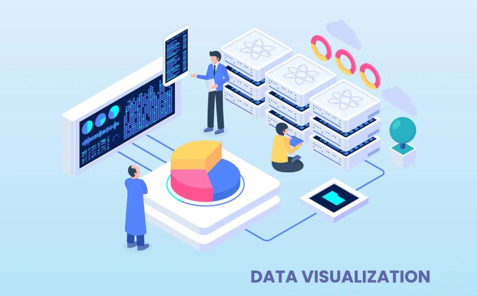
Importance of High-Quality Data Visualization
Videos and images can significantly affect your site’s ranking and SEO performance, but most of all, they ensure that your users have a pleasant experience navigating it. In today’s highly competitive digital climate, this is one of the crucial factors that will help you stand out from the competition.
Let’s take a look at a few tips you can use to pursue higher-quality data visualization on your website!
Make the Process Easier with Data Visualization Tools
Visual data may be easy to interpret, but that doesn’t mean data visualization is an easy thing to do, at least not without a bit of help. If you’re not particularly savvy when it comes to visualizing data, it might be a good idea to hire a branding agency.
If this is not an option and you’re expected to create a visual representation of information entirely from scratch, you’ll likely be staring at a blank page for a long time, wondering where to start.
Fortunately, as you might have guessed, technology can help out. You’re not the first to be dealing with this problem, so companies have already come up with excellent visualization tools that you can use to make the process much more straightforward.
Even complete beginners should be able to create visual representations of any kind of data, so this doesn’t have to be a grueling task.
That said, because there are many data visualization tools out there, you might be stuck wondering which one to go for. Here are a few factors you should consider before taking your pick depending on your situation:
- If you don’t have a lot of experience with data visualization, pick the tool that’s easiest to use
- Try to go for software that can handle large datasets
- You should be able to create all types of visual data, including graphs, charts, maps, etc.
- Last but not least, try not to overpay
Infographics Are All the Rage
An infographic is one of the most fun and informative ways to deliver information to your website visitors. We don’t need data to back up this claim, just think about how easy it is to read a well-made infographic and gather information from it, and you’ll understand what we mean.
Infographics are handy if you have a lot of statistics and boring numbers to present. If you can arrange them in interesting graphs and pie charts on an infographic, they’ll be much easier to take in.
The most effective way to tackle infographics is to focus on statistics relating to a specific topic you need to cover and show them in colorful images. We’re not saying you should treat your visitors like 5-year-olds, but even the most hardened finance experts will appreciate a break from staring at numbers.
The convenience you provide your visitors by taking this approach will not be forgotten, and they are likely to remember your website as the place to find clearly-presented information.
Optimize your Visual Data for Mobile
As you’re probably well aware, most users browse the internet using mobile devices, either phones or tablets. Since you absolutely want to target this vast pool of prospects, your website design should heavily focus on responsiveness. This goes for your data visualization, as well.
If you want your visual data to be effective across platforms, it should offer the same experience regardless of the devices your visitors are using.
Your visuals should quickly and seamlessly adapt to the smaller screen and look as if they were always meant to be presented in this way. Otherwise, they may be a challenge to read, entirely defeating the purpose of data visualization.
Any web design company will know exactly what to do when it comes to making your visual data responsive, but here are a few guidelines so you know what to look for:
- Your visuals, and your entire website for that matter, should be viewable in a variety of resolutions
- You should keep your colors contrasted to make reading your infographics easy on the eyes
- Keep your images small; you don’t want your site to take forever to load
Learn the Basics of Data Visualization
Before you can begin creating visual data on your website for your web design company, you’ll need to learn the differences between the various types of visuals and graphics.
The best place to start is with tables and charts. You might think you already know all there is to know about these two forms of visual data, and you’re probably right, but you should still practice the fundamentals every now and then. Even the most straightforward chart can end up confusing your readers if you’re not careful.
Some of the most useful types of charts you should master include the following:
- Bar graphs — used for presenting radical changes in a particular value over a specific period or comparing different demographics
- Line graphs — used for presenting more moderate changes in a certain value over time
- Area graphs — used to track changes of various data sets, as well as emphasizing the part-to-whole relationship between several data clusters over time
Conclusion
“A picture is worth a thousand words.” Now there’s a phrase you’ve heard a million times, but the fact that it is cliché doesn’t make it any less accurate. So much can be conveyed via a picture, and the benefits of presenting your data in visual form are massive.
Sure, you can put data into words or numbers, but often this makes it too difficult to understand, even for an expert audience, let alone a layperson. This is especially true in today’s fast-paced digital world, where everyone wants to gather information at a glance.
You might write the most amazingly informative article in the world, containing all the answers to the questions of humankind. Still, the sad truth is that unless you can make it digestible, the average internet user will not bother with it in 2021.
Thankfully, you are now equipped with a list of tips on data visualization and the know-how to present data in the most engaging way possible. You no longer need to be overwhelmed by the enormous task of condensing all that information into an easy-to-grasp form. All you have to do now is get to work.